
Behind the Brand: Unlock Your Potential Tutoring

In a world where personalization and creativity have become integral parts of branding, Dr. Katrina Tamavakologos, affectionately known as "Dr. T," has crafted a tutoring service that not only unlocks the doors to knowledge but also illuminates the potential of every student. When you think of a brand, it's not just a logo or a catchy name; it's a reflection of the values and aspirations of the individuals behind it. Let's dive into the story behind the Unlock Your Potential Tutoring brand and discover the magic that lies within.
The Creative Spark for the Logo Design

Molly Fabiano, our creative graphic designer, discovered a wealth of creative opportunities within the name "Unlock Your Potential." The words “Unlock" and "Potential" ignited her creativity instantaneously. "Unlock" painted a vivid picture of doors, locks, and keys, symbolizing the path to unlocking new opportunities. Meanwhile, "Potential" evoked visual metaphors of light bulbs and brains, representing the limitless potential of young minds. This fusion of symbolism ultimately inspired the creation of a logo featuring both a key and a brain, blending the two concepts seamlessly.
The Logo Color Palette
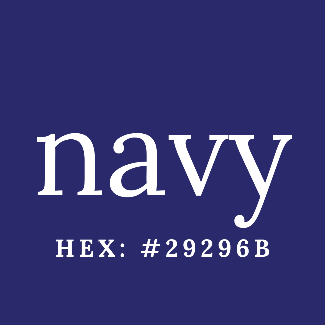
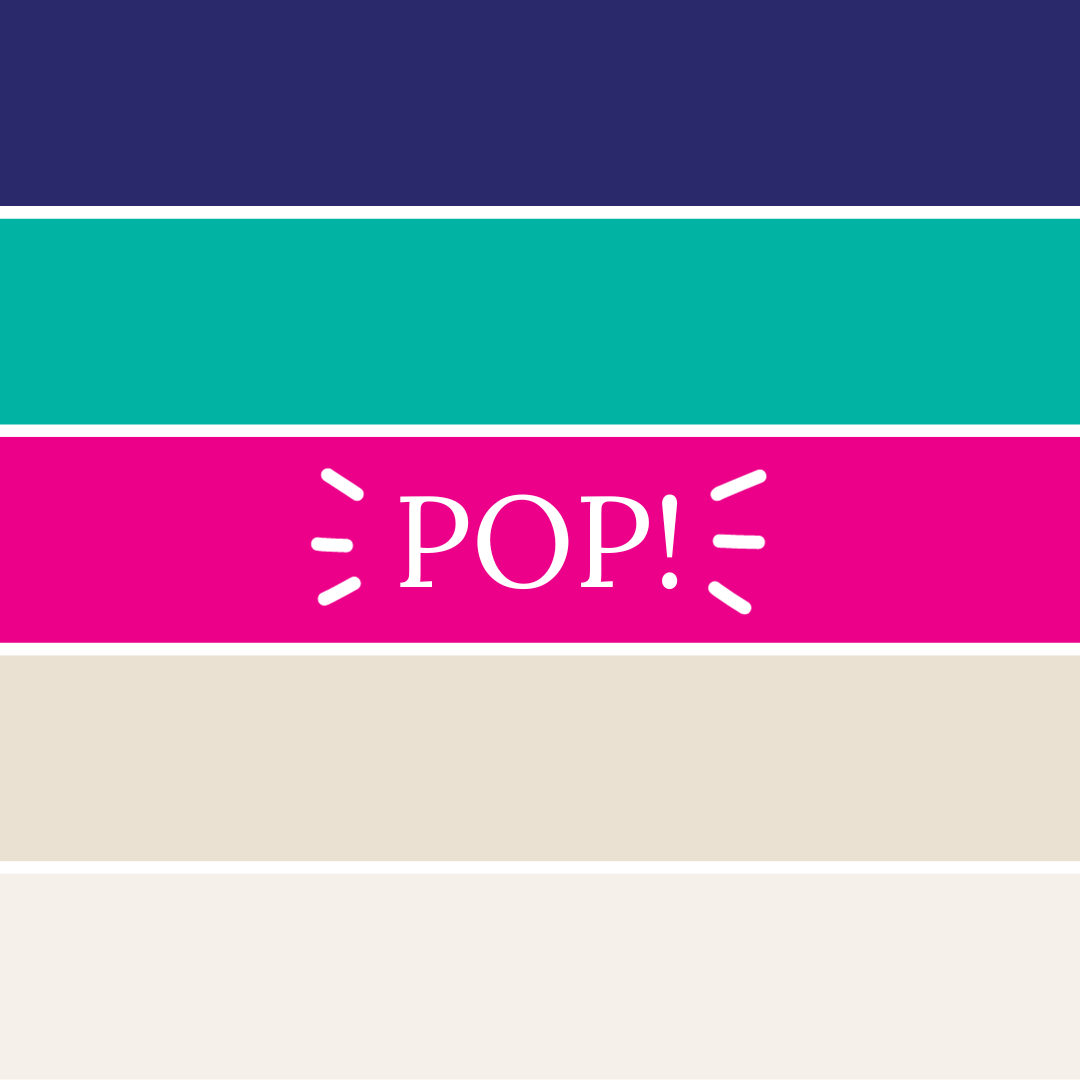
Colors play a pivotal role in branding, as they convey emotions and set the tone for the brand's identity. Molly knew that choosing the right colors was essential for UYP Tutoring's branding. The primary color was navy, symbolizing trust, reliability, and professionalism. It created a strong foundation for the brand's visual identity.

To inject vibrancy and a sense of playfulness into the branding, bright teal was introduced. This color represents growth, learning, and the excitement of discovery. But Molly wanted one more color to add a pop of energy, and she decided to go with bright, hot pink magenta. This color serves as a reminder that learning should be fun and engaging.
The combination of these colors created a visually striking and harmonious palette that not only looked professional but also radiates warmth and approachability.
Textures and Patterns for the Branding and Logo Design
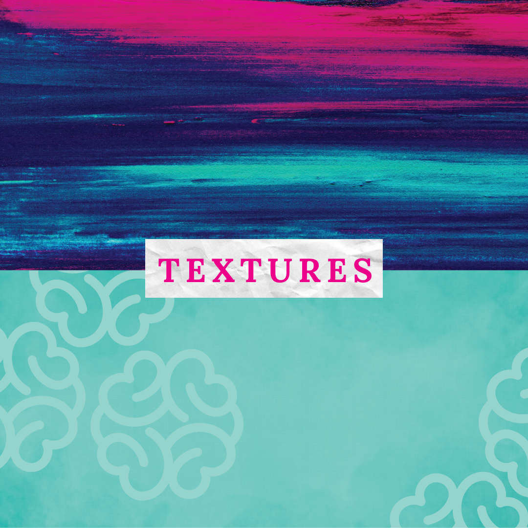
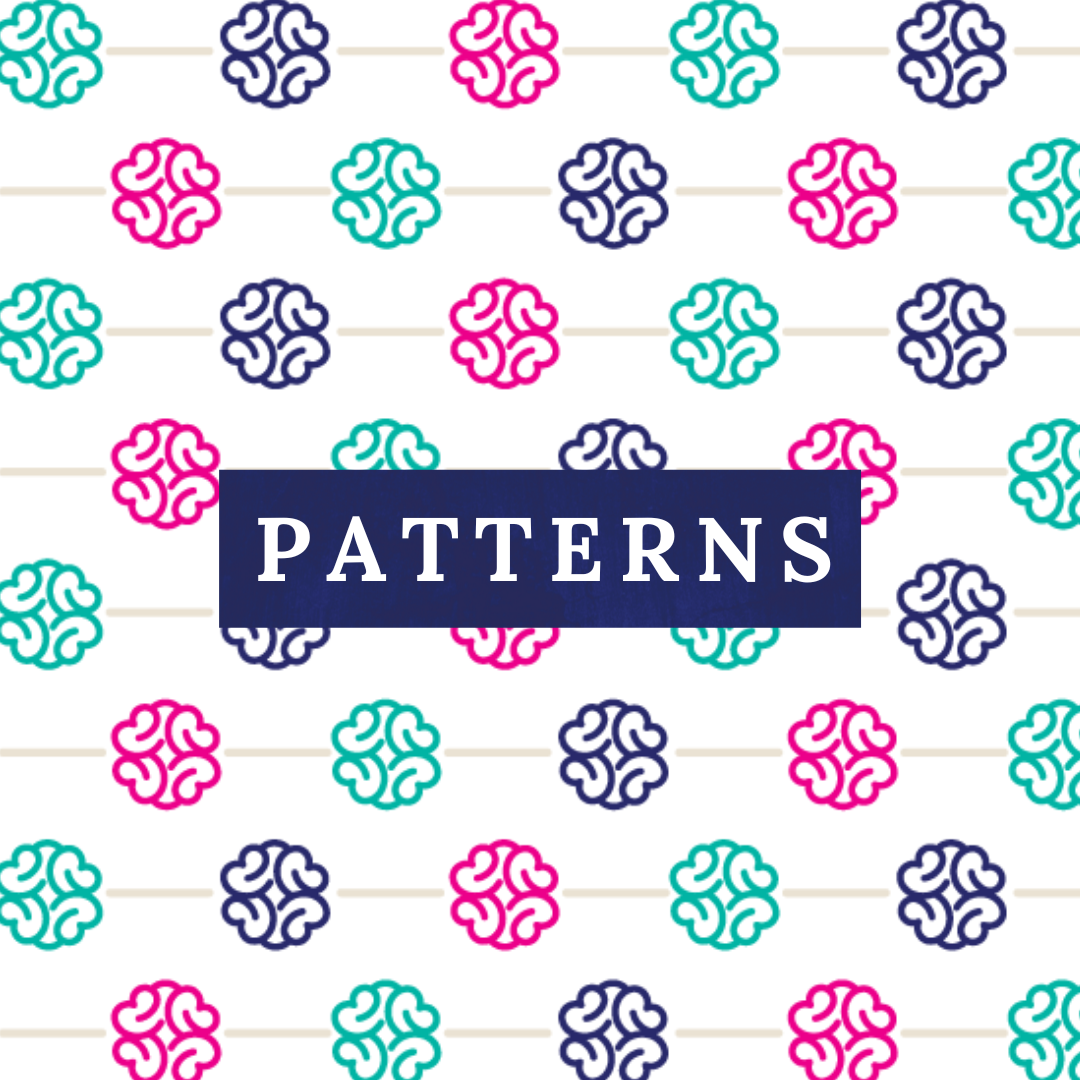
Molly's creative flair doesn’t stop at colors. She also loves using textures and patterns to bring a playful element into the brand's identity. These added layers of depth and character to the branding, making it more engaging for students and parents alike.
The Comfort of Professionalism in Your Brand and Logo Design

As a parent herself, Molly understood the importance of trust when it comes to choosing a tutor for one's child. A professional and well-thought-out brand identity can convey reliability, competence, and dedication. The professionalism of Unlock Your Potential’s branding would make a parent like Molly feel comfortable entrusting her child's education to Dr. T.

In a world where education is not one-size-fits-all, UYP Tutoring stands out as a beacon of individualized learning. The brand's name, colors, textures, and patterns all reflect the commitment to unlocking each student's unique potential and guiding them towards success.
So, the next time you're searching for a tutor who is not only knowledgeable but also passionate about nurturing your child's growth, remember that the branding of Unlock Your Potential Tutoring is not just a visual identity; it's a promise to unlock the boundless potential within every student.