
Why You’re Not Just Getting One Logo (And Why That’s a Good Thing)
One of the biggest surprises for clients during a branding project?
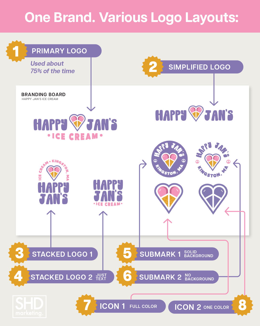
You don’t just get one logo.
When we create a brand identity, we always start with a primary logo—but that’s only the beginning. From that foundation, we build out a full set of logo variations designed to work across all the places your brand shows up.
Because the reality is: one logo simply doesn’t fit every situation.
Your Brand Needs Flexibility
Think about where your logo lives.
A horizontal logo might look perfect across the top of your website or on signage. But try to squeeze that same logo onto a business card or into a small digital space, and suddenly it doesn’t work as well.
That’s where variations come in.
A stacked or more compact version is ideal for tighter layouts like brochures or print materials. A simplified submark—often an icon or initials—is perfect for places like your social media profile image, favicon, or website footer.
Each version is designed with intention, so your brand looks just as strong in a tiny square as it does across a full-width header.
It’s Not About Picking a Favorite
A common misconception is that you’ll choose one version and use it everywhere.
But strong branding doesn’t work that way.
Each logo variation plays a specific role. Together, they create a cohesive system that allows your brand to adapt without losing its identity. No matter where someone sees your business—online, in print, or in person—it should feel instantly recognizable.
Think of It as Your Brand Toolkit
Instead of thinking “Which logo do I like best?” think:
“What version works best here?”
Your logo suite is a toolkit. Every piece is designed to work together, giving you the flexibility to show up consistently across every platform, format, and touchpoint.
And that’s where great branding really shines—not just in how it looks, but in how well it works in the real world.